I’m sure you have come across a website that looks good at first glance but then you find yourself focusing hard on the text when you try to read the content. Probably the fonts are too big, too small, too closely spaced, or too spaced out. Or maybe the colors or contrast aren’t just right. Maybe that font looks too childish. We can all recall a few instances of that. Typography accounts for 90% of website design. The typography and the font-faces impact branding of the website determine it’s readability, and insist a passive mood on readers psyche, alters user experience and much, much more. Typography maintains a design consistency throughout a website thus making it a more professional aesthetics.
A website that targets kids will be more efficient if they use bolder, curly, and ornamental fonts. And if the same set of fonts is deployed in a professional portfolio website, it will definitely send its audience a wrong message. Thus the choice of fonts will depend on the use case/ scope of your project.
Uniformity in sizes and font weight increases the conclusiveness in the design language of your website. Use of classes helps a lot in this department
The aim of content marketing is to draw people to your website via your content and make them stay so that they can be converted into customers. Having too many fonts on a website can look disorganized and confuse your visitors. It can also be distracting and take attention away from your all-important content but let’s be honest, it doesn’t look great either. With smartly chosen typography you can lure people in. The websites we develop have a maximum of 3 fonts.
The way the text is aligned with the flow of the website is of great importance. If implemented properly it will make the content soothing to the eyes ( read more readable).
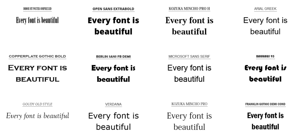
I personally use Dafont and Google Fonts for exploring font for my projects. There’s a new tool called flippingtypical for comparing fonts, it’s fun to use as well
At Lumenoid Studios, we believe that a good design is not just about aesthetics, but also about the communication. That’s the reason we have placed a strong emphasis on typography in our web development process. We are aware that typography can play a crucial role in conveying the right message to your target audience and thereby creating a memorable brand identity. Our team has a deep understanding of typography and how to use it effectively in web design. From choosing the right fonts to implementing proper line-height and spacing, we pay a close attention to every detail to ensure that the typography on your website is optimized for readability and aesthetics. Whether you’re looking to create a bold and modern look or a classic and timeless aesthetic, we can help you achieve your vision with our typography expertise. With our focus on both design and functionality, you can trust Lumenoid Studios to create a website that not only looks great but also performs exceptionally well.