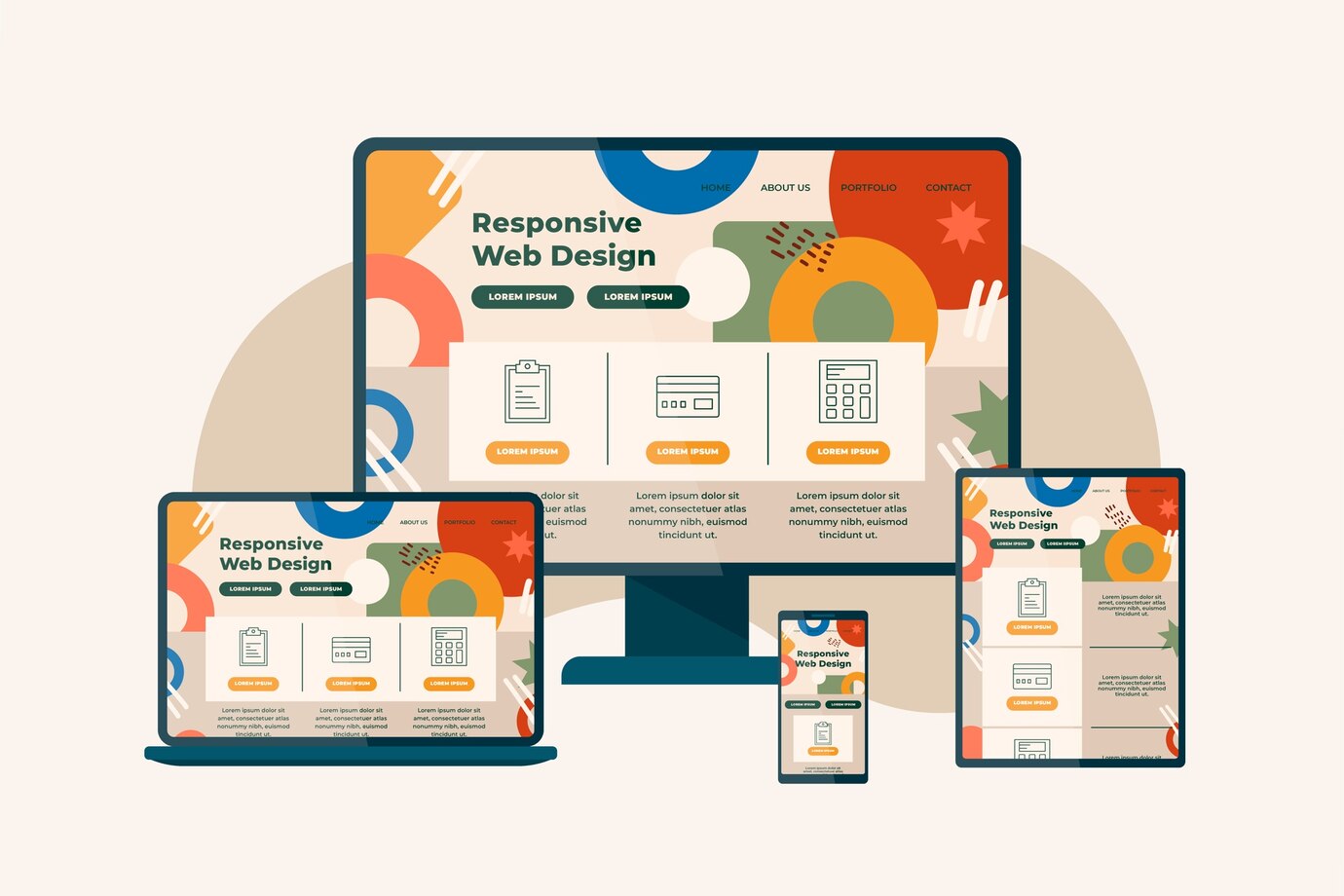
Hey there, web wizards! Wondering if responsive web design is still riding the cool wave in 2024? Well, not only is it still relevant, but it’s basically the VIP pass to the digital party! Let’s dive into the why and how of this web wonder.
1. Mobile Mayhem: Picture this – more folks are cruising the internet highway on their pocket-sized gadgets than on old-school desktops. If your website isn’t responsive, you’re practically locking the door on potential visitors. Nobody likes a locked door, right? Learn more about mobile dominance here.
2. Google’s Mobile-First Fiesta: Google’s got a soft spot for mobile-friendly sites. If you want to be the belle of the search ball, responsive is the way to go. Otherwise, you might find your website playing hide-and-seek in the search results – not the kind of game you want to be a part of. Dive deeper into Google’s mobile-first indexing here.
3. User Experience Extravaganza: Responsive design isn’t just about looking good; it’s about making your users feel like they’re on a magic carpet ride across all devices. Consistency is the name of the game, leading to happier users and more conversions. And who doesn’t want a happy user? It’s like winning the internet lottery! Explore the impact of user experience here.
The Impact Numbers Game:
Now, let’s talk hard facts – the nitty-gritty metrics that prove responsive is the real deal.
SEO Showdown: Responsive sites climb the SEO ladder faster than a cat up a curtain. Higher in search results means more eyeballs on your content – it’s the digital popularity contest, and responsive sites are the cool kids. Unearth the secrets of SEO impact here.
Conversion Cha-Ching: A smooth user experience translates into more successful actions – be it purchases, sign-ups, or whatever your website heart desires. Responsive design isn’t just a pretty face; it’s a conversion wizard. Dive into the world of conversions here.
Brand Image Magic: Think of your website as your online wardrobe. A responsive design screams sophistication and professionalism. It’s like showing up to a party in a tailored suit – you make a lasting impression. Explore the magic of brand image here.
The Responsive Rundown:
Curious about the impact of responsive design in real terms? Keep your socks on; we’ve got a checklist for you!
Plan It Right: Know your audience’s devices, go mobile-first, and prioritize like you’re packing for a weekend getaway. Dive into the planning phase here.
Design Like a Pro: Wireframes, prototypes, and a sprinkle of magic – design for the smallest screen and scale up. Learn the art of professional design here.
Develop Wisely: Frameworks like Bootstrap and Foundation are your sidekicks. Let’s take a closer look at these superheroes of web development.
Bootstrap, like a trusty Swiss Army knife for developers, is an open-source front-end framework that’s been a game-changer since its launch. Developed by the tech giants at Twitter, Bootstrap comes packed with pre-designed components, responsive grid systems, and a plethora of customizable styles. Its vast community and extensive documentation make it a go-to choice for both beginners and seasoned developers.

On the other hand, Foundation prides itself on being the framework for “people who care about code.” Developed by ZURB, Foundation offers a more modular and customizable approach, allowing developers to craft unique designs with ease. It’s a bit more lightweight than Bootstrap and provides a blank canvas for those who want more control over their design process.
Both frameworks have their strengths, and the choice between them often comes down to the specific needs of a project and personal preferences. But hey, in the world of web development, having options is like having a buffet – you pick what suits your taste.
Test, Test, Test: Tools like BrowserStack and Responsinator are your trusty pals. Test on all devices and browsers, like a chef tasting every dish before serving it. Check out essential testing tools here.
Tools of the Trade: From browser developer tools to responsive testing gems, use the right arsenal to craft your digital masterpiece. Uncover the tools of the trade here.
Best Practices Bonanza: Flexible layouts, readable text, easy navigation – it’s like building a house with a solid foundation and stylish interiors. Discover the best practices here.
Stay in the Loop: Responsive design is not a one-time gig; it’s an ongoing party. Keep updating and grooving to the latest web beats. Stay in the loop here.
CSS Frameworks Fiesta: For the developers in the crowd, commonly used CSS frameworks like Bootstrap and Foundation are your trusty companions. They streamline development and ensure your site looks fantastic across devices.
Indian Flavor: Ahoy, desi developers! If you’re on the lookout for an Indian-made CSS framework, check out Materialize. It’s like adding a dash of masala to your web development recipe!
In Conclusion: So, my fellow digital navigators, responsive web design isn’t just a trend; it’s a lifestyle. It’s the difference between riding the wave and being wiped out by it. Stay responsive, stay relevant, and keep rocking the web!
Remember, it’s not just about pixels; it’s about people. Happy surfing!